I love trying to make a logo look like what it does (hair in their case)


I love trying to make a logo look like what it does (hair in their case)

(2014) - Craig Arthur


'Flock Horror' (2014)

RIP Quincey. Won’t forget the day I met you when I was in Westfield and you said “you’re that designer guy”. You did your thing with Stööki and it’s something to be admired. We will all miss you bruv.

'Cheers' - Women's Manhattan (2013)

'Head-Drive Crash' (2013)


A series of illustrations based on the novel 'On the Beach' by Nevil Shute (2013)

(2015)


2016 - Started using brush and ink almost exclusively. Emerging into the noir style…

High Up. Began freelancing as a designer at this point (2016) after working in house, starting at Capcom, LVMH and then Apple Corps (The Beatles’ record label) as a designer
Typographic experimentation

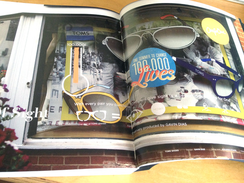
TOMS Window designs published in the book 'Fashion Window Shopping' (2013 - Chois Gallery)


Identity for Salon (Crouch End, London 2013)
Sea Food - BBC good food magazine (in the end it couldn't be used and they chose a Photo)

Automated Hair Salons (Women's version)

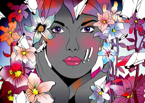
Automated Hair Salons - Men's version (2013) - This highlights ‘Phase Three’ of my style where I ditched the grey and just used brighter colours. The use of blue-purple lines was also the beginning here.

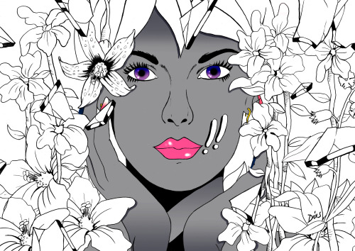
Botanicals - 2012 - A favourite my Mother and Aunts really like. Use of the !! again, which wasn’t frequently used at the time. I’d redraw the face with cheekbones if I was to redraw, but overall quite happy because the colour makes up for the lack of technical details.
'I need those' (2013) - No reference to anyone real in this image
